July – December 2020
Making recipes easier to find
At MyPalate, I lead the research and design of searching for recipes on our mobile app.
"I’m 24, with diabetes, hypertension, and high cholesterol. When I look up healthy Asian recipes, they’re always Americanized and not authentic."
In North America, over 40 million people have health conditions affecting their diet. Founded in 2019, MyPalate is an early stage startup focusing on helping young adults with dietary restrictions enjoy culturally authentic foods, through a recipe app.
I joined in early 2020, around the time we released our MVP on the App Store. I designed pitch decks and web pages, did user testing and product research, and was the sole designer working on a complete overhaul of our app's Search – one of my favourite projects.
Searching for recipes
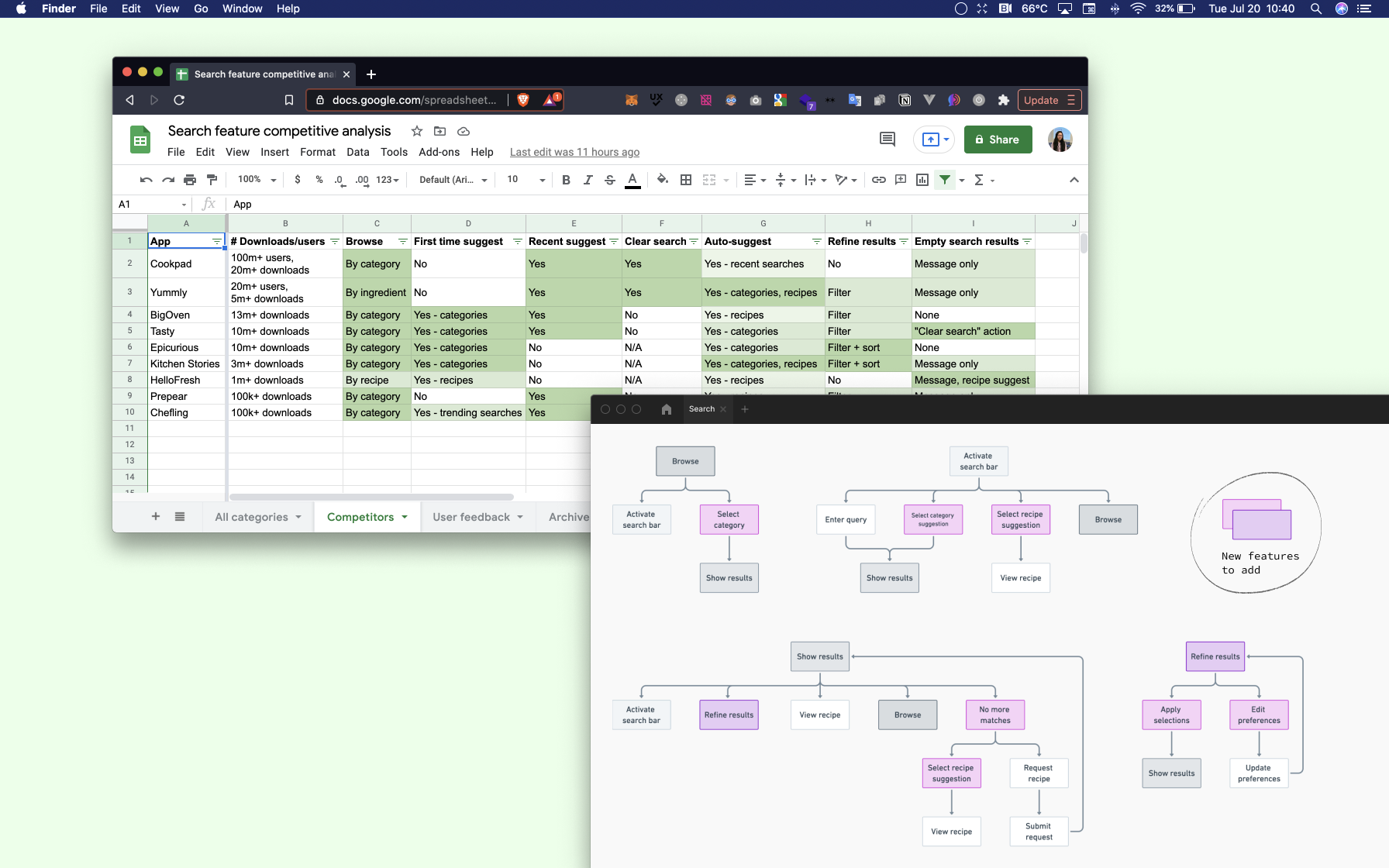
Search was one of the most frequently used parts of our app. We knew competitors had features we lacked, and we were getting a lot of user feedback about the search experience. I organized the insights from competitive analyses and user test recordings into three key themes –
Content first. 10 out of 10 test users I observed wanted more information when looking for recipes, to make more informed choices before visiting a recipe page. There was also confusion around terminology used in the app.
Time-consuming. Compared to competitors, we were lacking in features that helped people save time, like search suggestions and filtering.
High dropoff. During user testing, 75% of people reached the empty state of the search results page. I wanted to explore solutions that were better than showing a blank screen.
MyPalate's initial search flow, before I started working on the app
"I want more information."
Our current search results page wasn't showing people what they wanted to know about recipes, and a lot of people found our categories hard to understand. I first decided to tackle content and information architecture, because it would heavily impact other areas of the app. I had two goals –
Prioritize content. The recipes in our database were currently only tagged by cuisine, health condition, and allergies. People wanted more information, but I had to find out what was most important to them, which would affect which tags we added first, as well as visual hierarchy.
Define categories. People were confused with how our tags were grouped. For example, vegan and vegetarian were under health conditions, and a user with a gluten free diet hesitated to select "gluten free" under allergies, since they did not have a gluten allergy.
Since there are a lot of recipe apps on the market, I tried to find an average of the most common categories and groupings among 10 competitors. But, I realized they all differed much more than I expected, leaving me without answers. So, I used the data I collected to develop a survey asking participants which categories were most useful to them, as well as a card sort study to understand how they grouped categories.
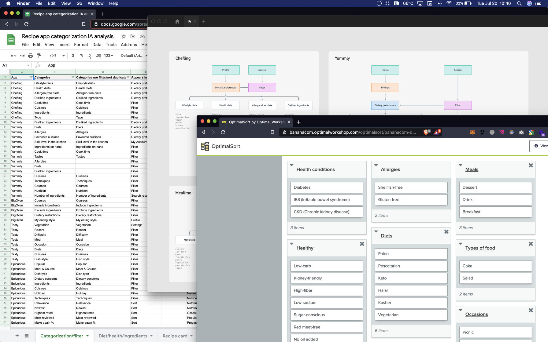
Analysis of competitors' recipe categories, and card sort study
I recruited 20 participants aged 18-32, who cooked at least once a month. Everyone received the same 30 items to sort. Half did a hybrid card sort, starting with titles "Health conditions" and "Allergies" which we currently had on our app. The others did an open card sort and named all groups on their own. I wanted to see if this variable would cause any differences.
In both studies, items like "Halal", "vegetarian", and "paleo" were often grouped together, in a different group from items like "high fiber", "low carb", and "sugar conscious". But, there was overlap in how the groups were named, especially with the word "diet".
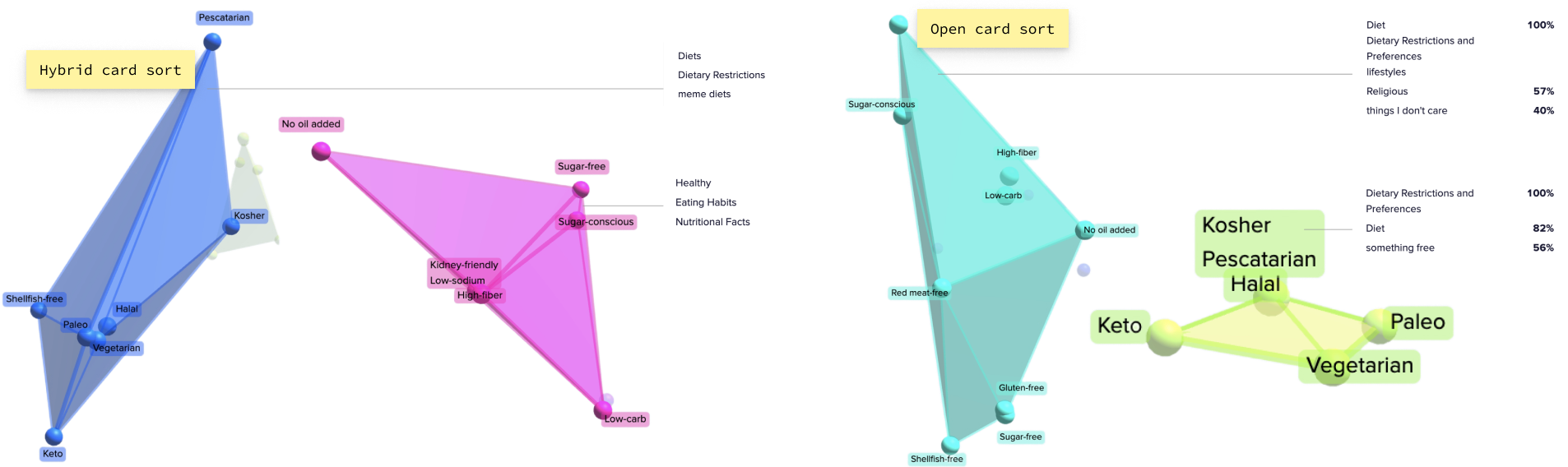
Visualization of commonly grouped items and titles
People tend to group diets together that are typically linked with one's identity.
Looking at the two separate groups that had been created in both card sorts, I inferred that people see a clear distinction between diets closer to their identity, which don't change as often when looking for recipes, compared to other diets that are more occasional.
I used these findings to update our information architecture, with a plan prioritizing most requested categories for tagging. My research also influenced the categories associated with profiles, which categories were automatically applied to search results, and how they appeared when refining a search.

Survey results and updated information architecture
Redefining the search experience
Now that I had a better idea of what people were looking for, and how they wanted to search, it was time to apply these insights to explore new features and visual elements.
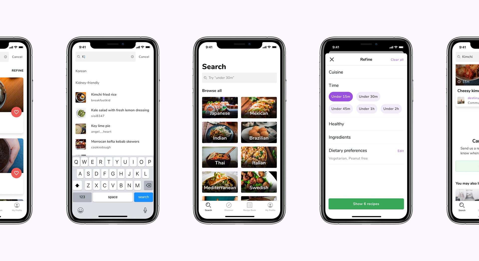
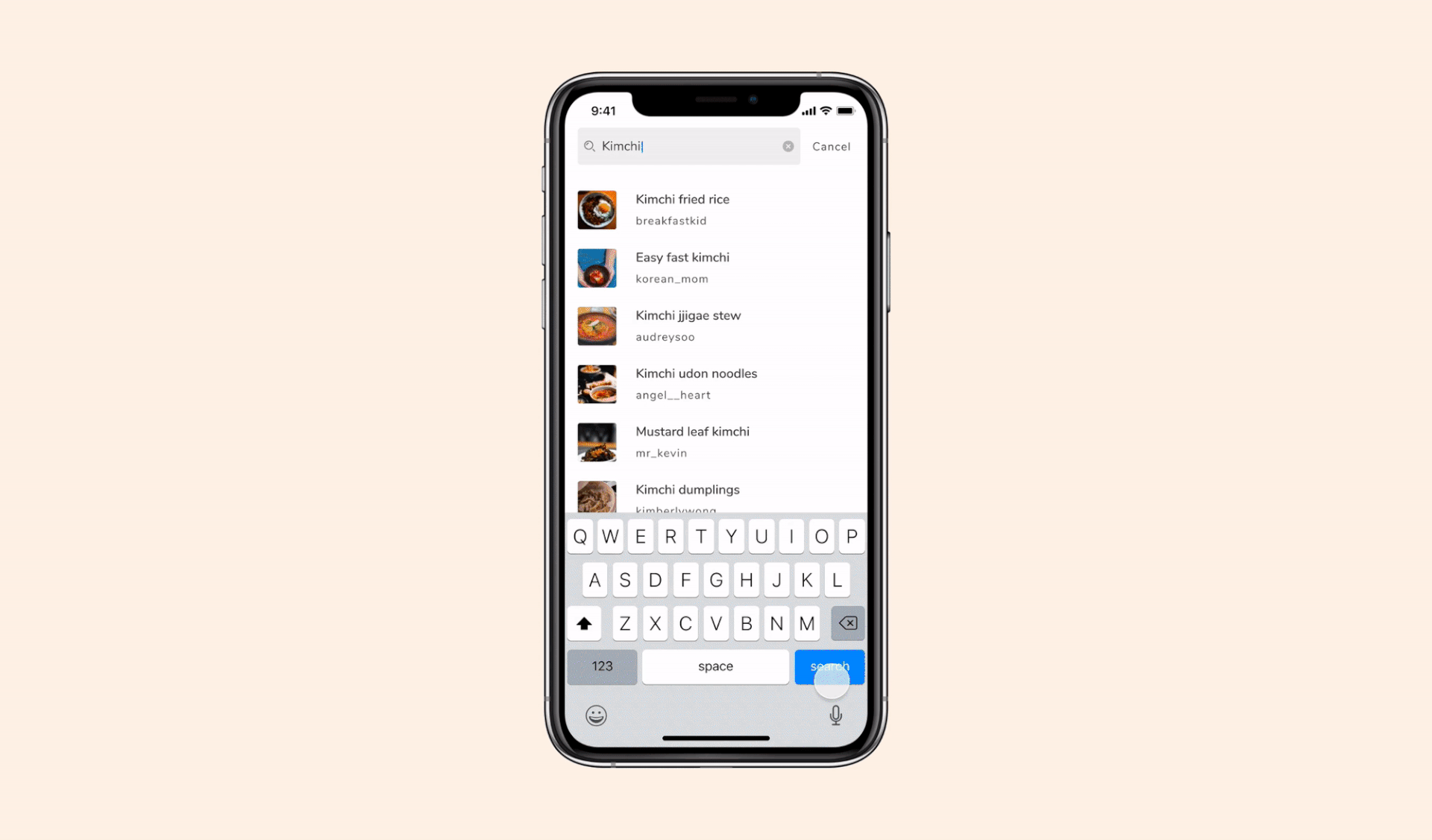
Searching for kimchi
People wanted us to help them find what they're looking for, save time, and make better dietary choices. We wanted to bring our search experience on par with competitors, to keep users from leaving. I compared other recipe apps to prioritize features within search, mapped out our existing search flow, and proposed new features –
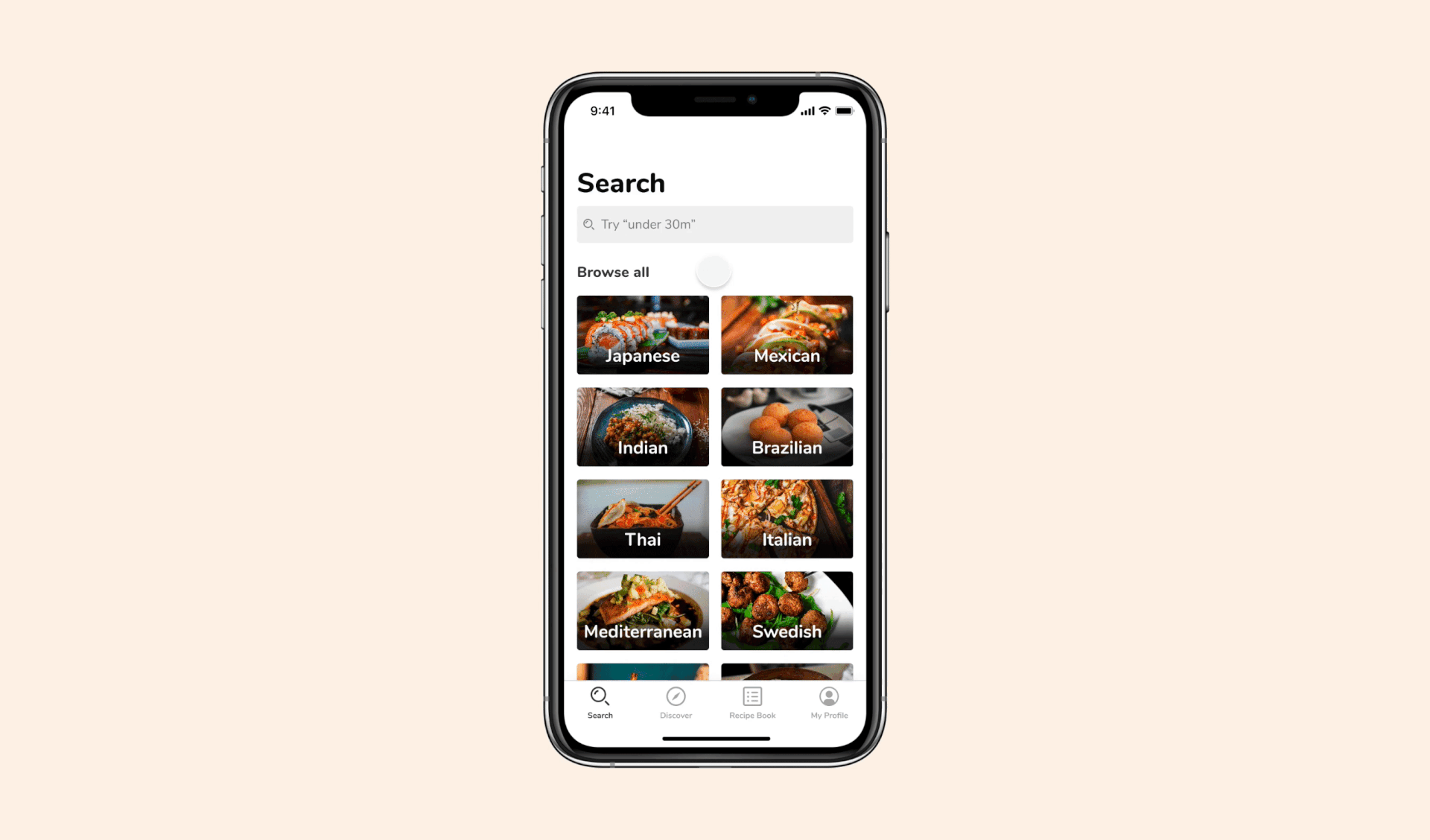
Categorical browsing to look through what's available.
Search suggestions to reach your recipes faster.
Filtering to narrow down your search results.
Updated search results to include more relevant information about recipes, and provide solutions when there are no more matches.
Competitive analysis and flows within search
Browse recipes
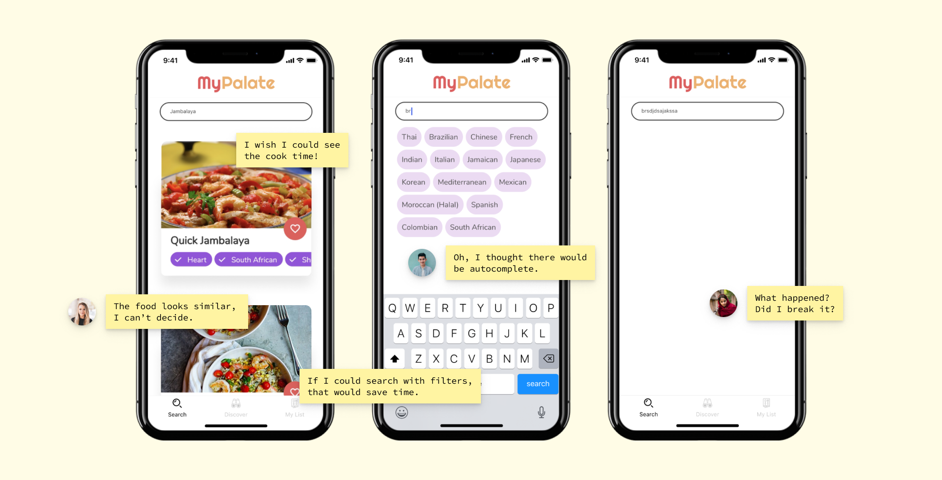
"I don't want to get pigeonholed into choosing a recipe, I want to see my options."
The current search page forced people to either scroll through a list of seemingly random recipes, or use the search bar. When I watched people use our app, some said they didn't always have a specific search term in mind. They preferred being able to scan through available recipes.
With this redesign, I was limited to organizing by cuisine, since it was one of the only categories that the recipes in our database were fully tagged by. But it worked out, seeing as "cuisine" was the second most popular category from my survey.
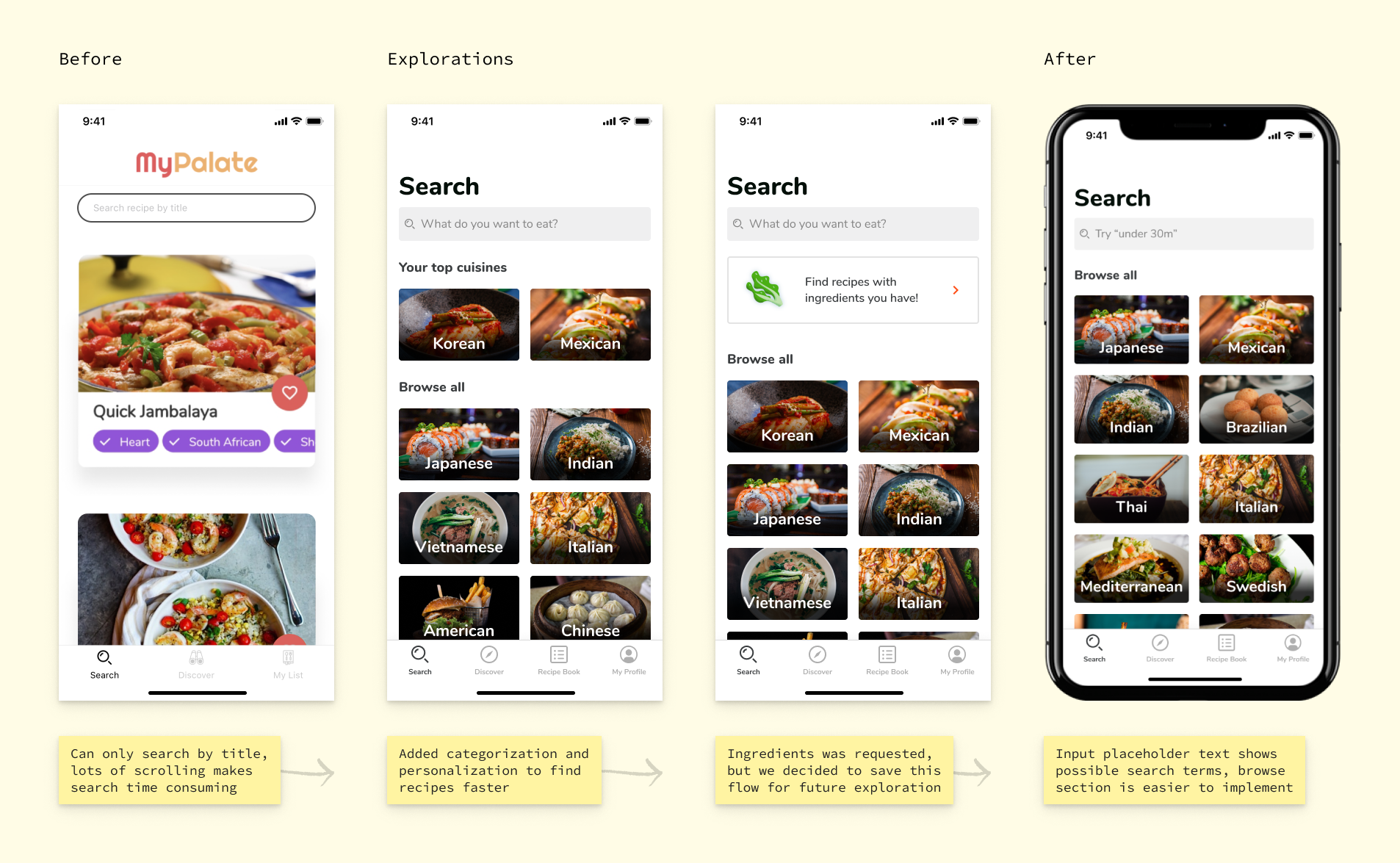
Designing categorical browsing
Search suggestions
Suggestions was a feature that people expected to see. After starting to type in the search bar, users were visibly surprised at the lack of feedback. One person paused mid-type, waited on their phone for a few seconds, saying, "Oh, I thought there would be autocomplete."
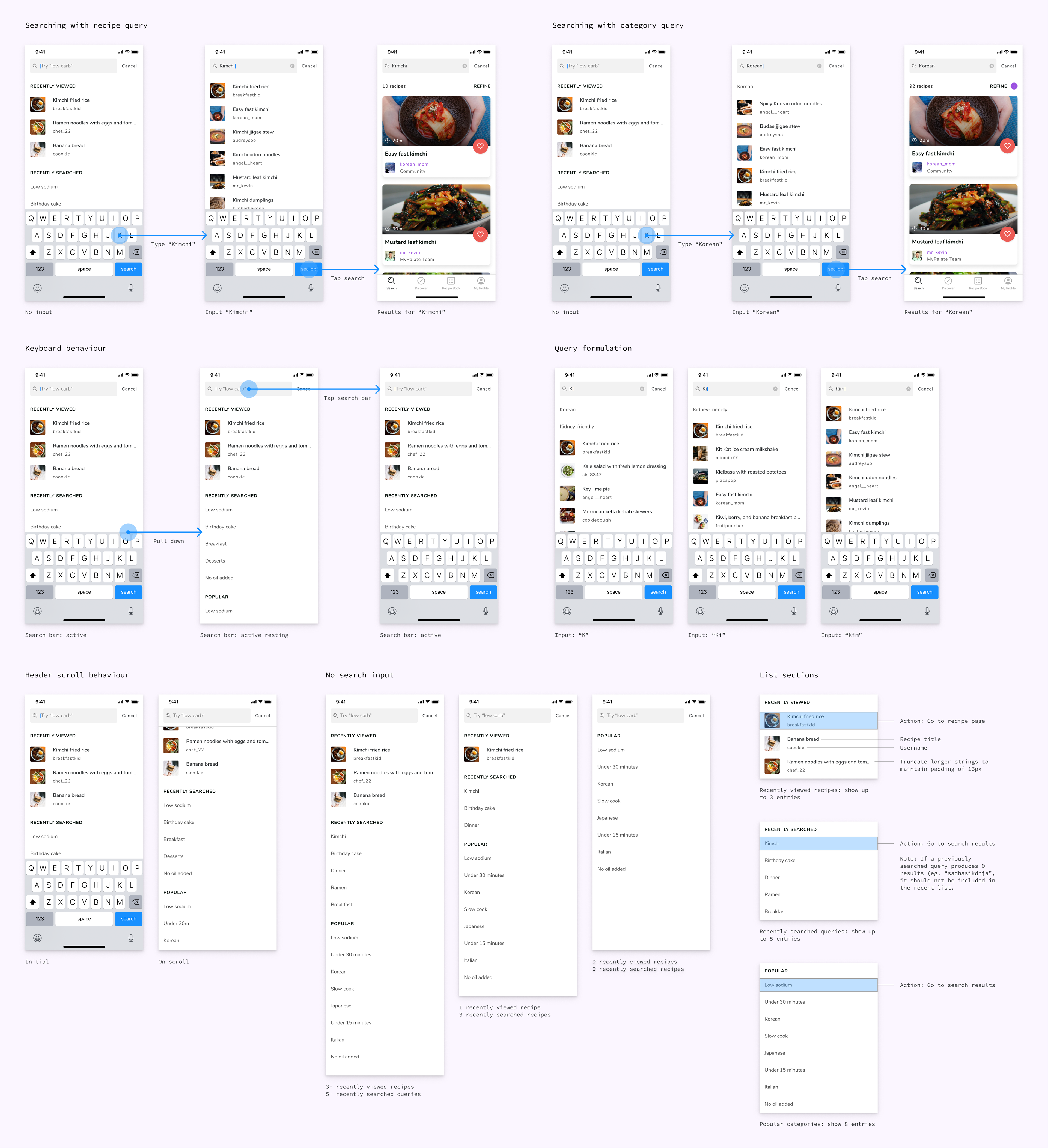
For suggestions before user input, I decided to place recently viewed recipes and searches at the top, with the goal of helping people reach recipe pages faster. During input, suggestions would dynamically populate based on the query. The ability to delete recent searches was a nice-to-have that ended up being out of scope.
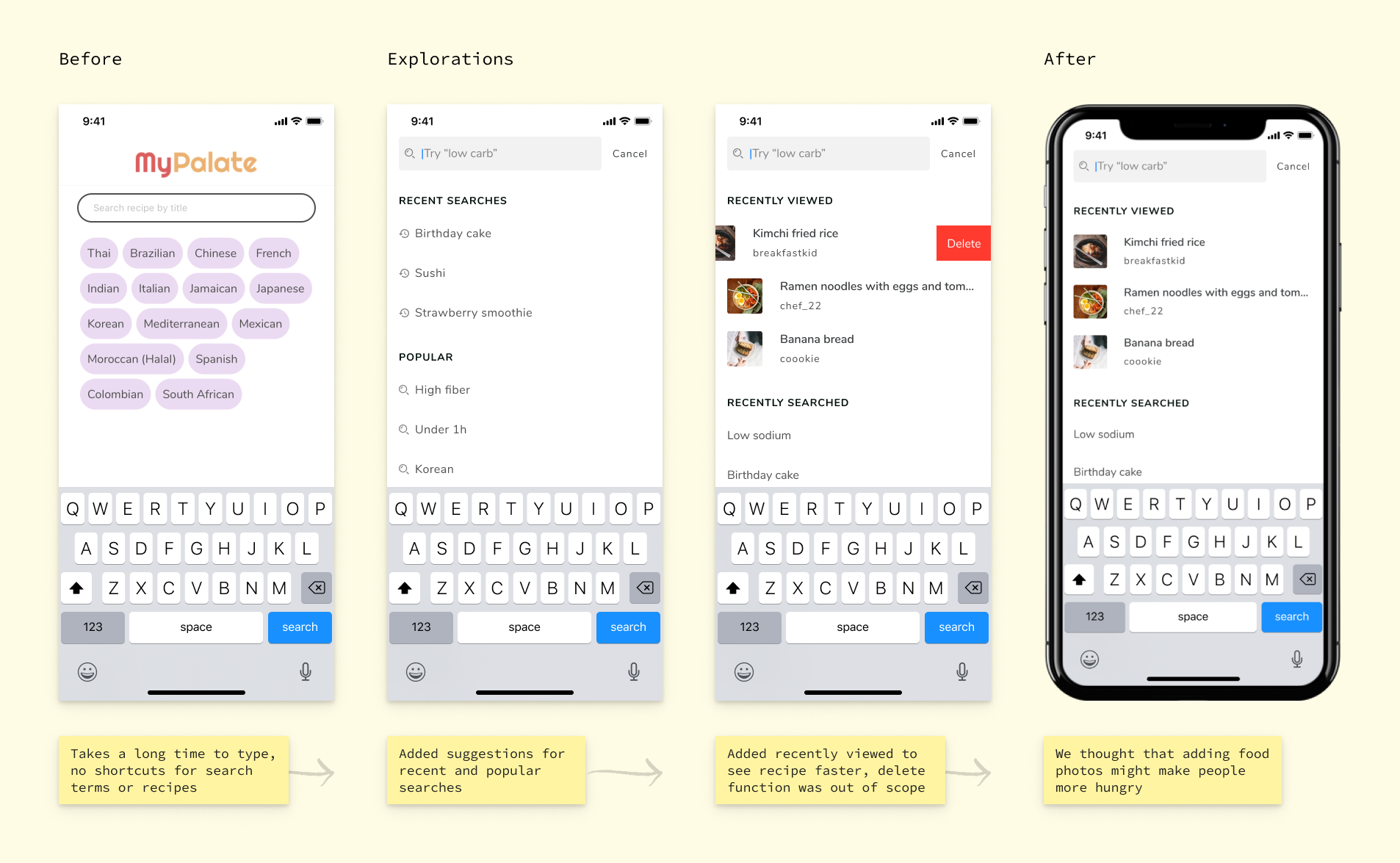
Search suggestions before user input
Layered searching was a new functionality for this version – previously, we only supported searching by recipe titles. For suggestions, this addition came with lots of new considerations on the design side, like conveying the distinction between recipes and categories, defining the order that different items appear in as well as their maximum values in list sections, and what suggestions would look like for a first time user compared to a returning one.
Refine recipes
Filtering was one of the most important features on this project. During testing, 100% of users expressed high interest in filtering results, and all of our competitors had it. Because of tight time constraints, I relied on informal concept testing and design reviews with internal team members to get feedback.
I went with the term "refine" since it encompasses both filtering and sorting, although we decided to focus on filters for now, since most people found filtering more valuable than sorting. We were focusing on iOS since the majority of our users had iPhones, so I stuck to iOS patterns when they made sense.
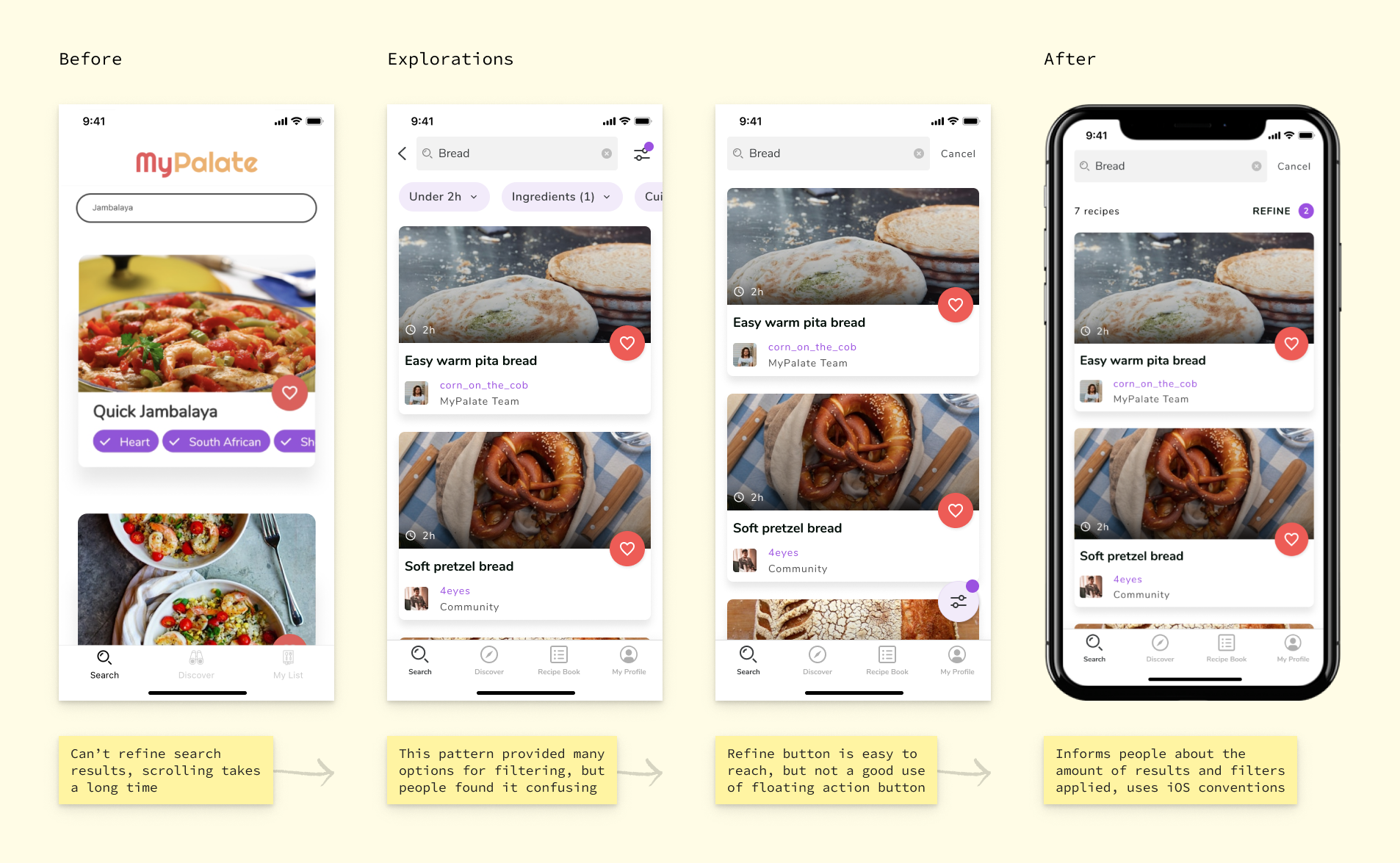
Accessing filter from search results page
The category structure I had developed earlier, laid the groundwork for the filtering feature. Because the current recipes in our database didn't have many tags yet, I designed for prioritized categories, while maintaining an adaptable format to easily add or remove additional sections, based on what would be possible for the upcoming release.
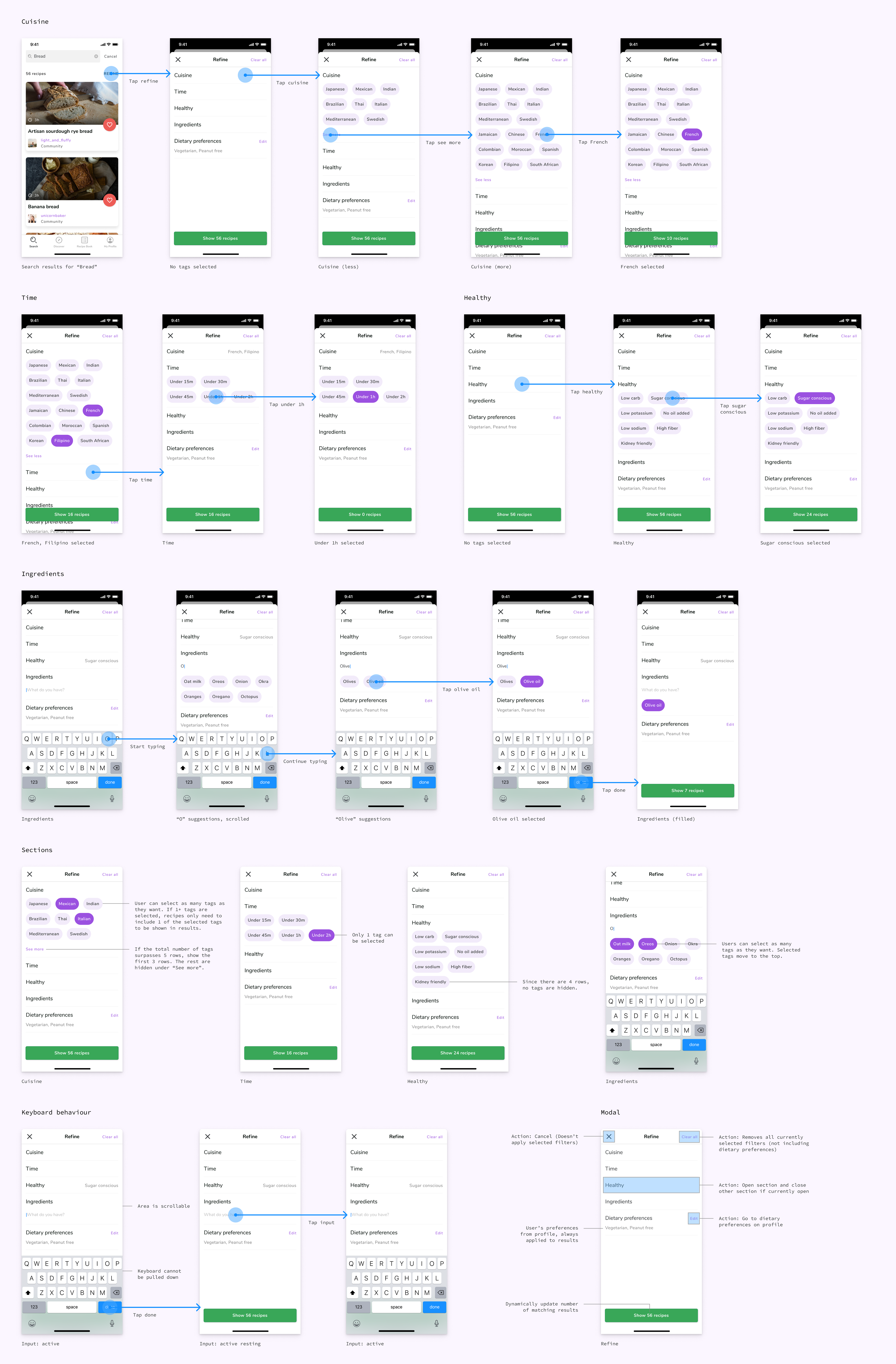
Filter interaction
Search results
People weren't satisfied with the amount of information being shown from the search results page. They wanted more to help them choose a recipe. I redesigned the recipe search result card to include what people cared about most.

Recipe card exploration
"What happened? Did I break it?"
It was pretty easy to reach the empty state of our search page, and as a result, people would leave our app without a good reason to come back. The root cause of the problem was simply a lack of recipes.
This wasn't something we could fix immediately, but I could put a Band-Aid on the situation by letting people know what was going on, and directing them towards alternatives. Fortunately, we had already added the ability to request recipes, so I implemented this into the search flow – a feature that no other competitor had.

No results
I made the experience a little more personal compared to other apps, by showing tailored messages based on if users were viewing a page with zero matching results, or if they had reached the end of a list, and if they had applied any filters or not.
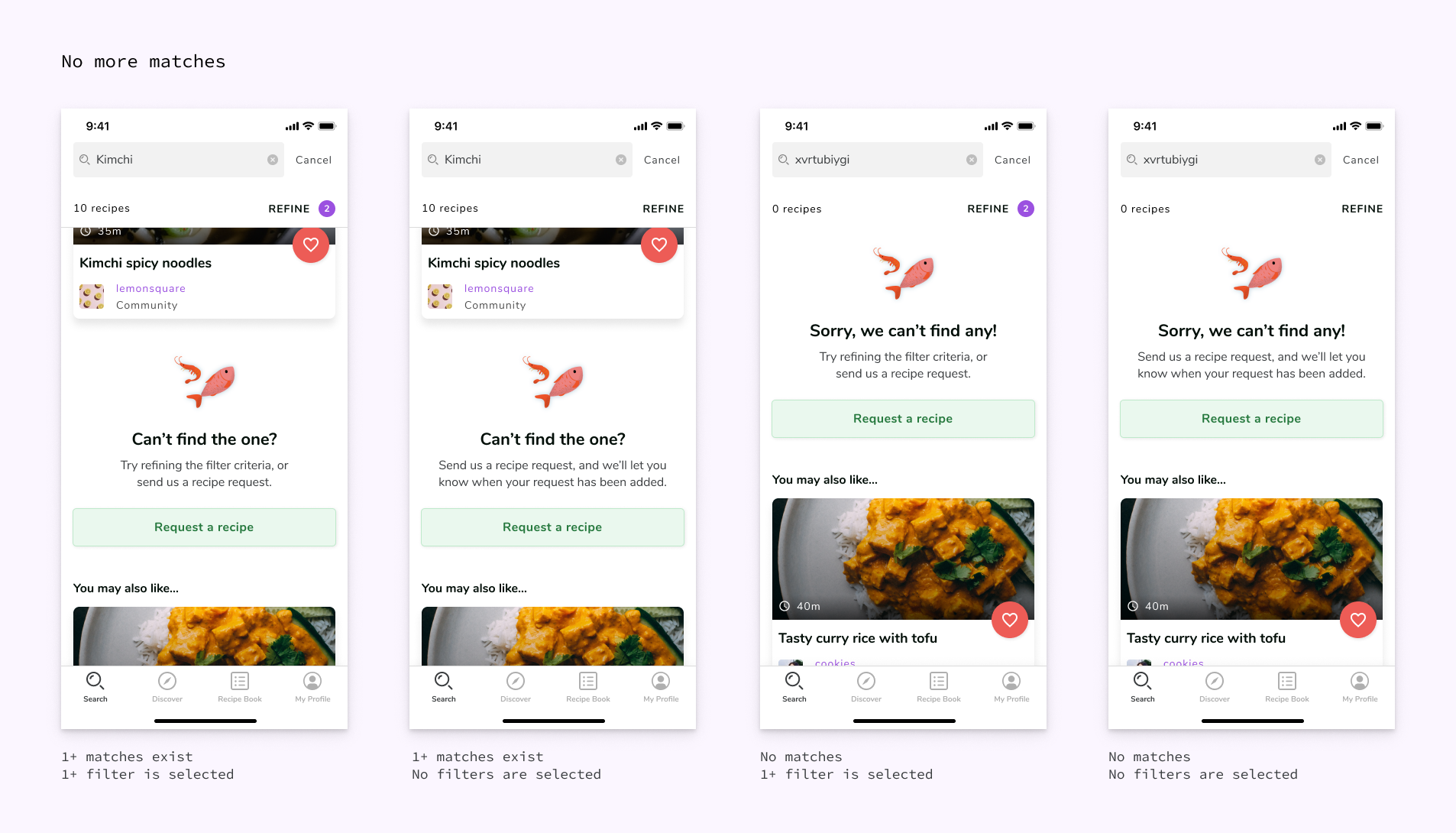
Empty search result states
Interacting with search results
I really enjoyed working on search. It was a lot of fun, and I even had the chance to share my design process to 200+ people during an event where I represented MyPalate. I learned about...
Communicating research
This project taught me a lot about extracting value from research findings. What I learned about our users from conducting interviews and tests ended up shaping our product requirements and feature roadmap. In order to share relevant insights with others, I found it was important to define clear research goals ahead of time, and present the data in a readable and accessible manner, for future reference.
Working with constraints
With limited resources for research, I had fun using anonymous social apps to recruit participants, and learned to evaluate risk and impact to determine research priorities, because you can't test everything. I would have liked to collect more quantitative metrics to measure the success of my designs, but didn't have the capacity to do so.
There were also a number of technical and design constraints. While I was working with MyPalate's existing brand system, the app was undergoing a visual refresh, and there were designers working on other features. Reusing interface patterns was key to making the app feel like it was all made by one person. On top of this, I was also limited to the categories in our database, and the way search already worked.
MyPalate
Currently, this project has been put on pause mid-development. Although I've been fortunate to see some of my work come to life, MyPalate has pivoted from a recipe app to explore other ways to help people enjoy food, with the intention to continue building our app in the near future.
Shoutout to co-founders Tank and Derek for trusting me with their vision, our engineers Thomas, Minh, Viet, Nihal, and William who explained entity relationship diagrams and discussed implementation & edge cases with me, as well as designers Calvin and LJA for always being there to share feedback, and the rest of the MyPalate team for testing my designs and being really cool.


